I'm making a horror game #08
When the UI isn't cutting it.
I'M MAKING A HORROR GAME
7/29/20233 min read
Welcome to another I'm making a horror game post. Since last stream, I went back to the drawing board for the UI. The menu I had set up was cute and simple, but it just wasn't it... not anymore. Happy reading!
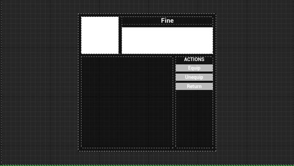
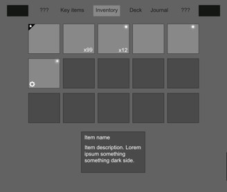
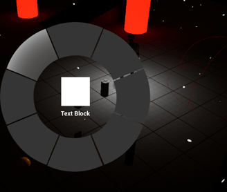
Here is what the inventory/menu looked like before. Very minimalist, a total of 9 possible item slots, with a few options, such as Equip, Unequip, and Close menu (Return.)
This menu works, there's nothing wrong with it, except that it didn't fit the needs of the project anymore. With the recent developments, I need room for items (albeit limited), for cards, and I'm separating key items from regular items to offer more space to the player.
There are a couple of other things that are on my radar, but it's too early at this stage to know if I'll get into those. More details later.
Knowing all of this, it was clear that the UI needed an update.
THE PROBLEM
THE SOLUTION
Back to designing something more sensible that would tick all the boxes I need it to. I used a design software to put together a vision for what I would like as a menu/inventory screen.
My first step was to make sure screen real estate was better used. There are still a couple of spots that could be filled in, but there are other elements that could make their way there.
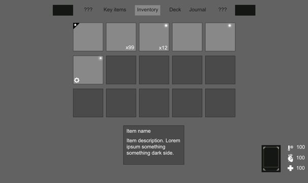
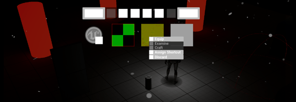
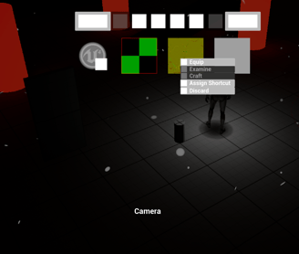
The top of the screen has clearly defined tabs, which are fulfilling different needs, such as a key items inventory, a regular item inventory, and a card inventory.
Taking the time to do this was a great exercise, and I was excited to implement it all in the game!
THE (temporary) RESULT
So here's what my foundation looks like. The tabs will be icons representative of what the player will find in each of them. This particular screenshot is the inventory tab, so there's some information about the item at the bottom of the screen, as well as various options when clicking on one of the items.
These options are still TBD. I'm not exactly sure what I'll put in there. I think crafting would be neat (I'm a huge fan of crafting game.) Maybe it'll be a stretch goal. For now I'm very happy with the new UI design.
Thanks for reading!
Seeing this new UI in the game is an amazing feeling. It all happened so quickly and smoothly, I was expecting more issues. I think once it'll have proper art it'll look even better (and I cannot wait!)
I'll see you for part #09! (oh dear, we're almost at #10)
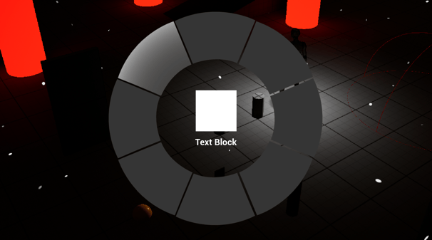
As for the radial menu, I made it much simpler for now. Adding the different parts from the wireframe should be easy. The player can quickly access it by pressing a given input, then choose which item/card before releasing, which sets the item/card.
This is what I'm currently working on (aside from now, this blog post is a short break.) The idea is that this radial menu will communicate with various blueprints to allow the assignment and selection of item/card.
So far it's been pretty straight-forward.
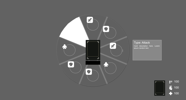
I also want the player to have quick access to important items or cards they may need. I chose to go with a radial menu. The player will have the ability to assign an item or card to each segment. Then, they'll be able to open the radial menu to quickly choose the item they need, whether it be a bandage to heal, or a card to attack.
The radial menu will feature minimal information, likely the item or card's image, as well as the name. I'm still exploring how and which information to give, as it is crucial to keep it simple enough as to not overload the player with information they do not need at that point.
If they're trying to defeat a creature, I don't want to present them with a huge description, for instance... that would suck.